Sunday, July 31, 2011

Better late than never


It is in the nick of time that I have finally made up my mind on what to do for the 2nd alphabet. As I am into feathers at present and my chickens are malting profusely I would be silly to pass up the opportunity to try my hand at alphabet feathers. I have taken the photos up close to give them an ethereal quality. I am in love with the delicate nature of feathers, and their ability to keep a bird in the air, to glide,and soar to the highest heights.

Sunday, July 17, 2011

Kim Schoenberger - almost complete!

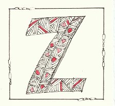
YAY! My first alphabet for 2011 is almost finished. My perspex arrived last week so I was able to start piecing it altogether, I'm just waiting on the base to complete the piece.


Sandwiched between two sheets of perspex, each letter (on 7 x 7 cm square 300gsm paper) are held together with stainless steel miniature bolt & nuts, as well as, one at each corner with spacers allowing the letters to swing within the sheets.


Then, turning it around you can see stitching and the makings clearly visible.


A close up as to see the perspex joined together with the nuts & bolts.


And Z in its own little display box living in the land of Z'topia. Lovely little base to hold it upright.


Side view - you can see the base with grooves to hold Z up and the nut & bolt at the top to hold it in place.


Then again being able to see the makings from behind.


ps. I must thank my brother Richard owner of Australian Marine Windows for supplying me with all my perspex. His schedule is so busy with installing boat screens all over the world, and yet he still manages to find the time for me!! Thanks bro'

Finished First Alphabet


After a fair amount of internal debate I decided to make a very simple accordion book. I had considered a double accordion and mounting the letters on both sides to make a smaller book. I decided to go with all the letters on one side so the book could be opened up and if desired pinned up on a bulletin board to show the complete alphabet. Each letter was mounted on red paper and the book is black--carrying out the black and white with a touch of red theme. I still need to make the covers. The book will tie with red ribbon.

Friday, July 15, 2011

Making progress - will catch up eventually!  Violet

Wednesday, July 13, 2011

Finished first alphabet


Finally the finished first alphabet! I wanted to put the negative and positive letters together for presentation. I put each pair on a rectangle, top to top, folded each one and tied them together in one long string. I keep it tied up as a book, but it can then be opened out length-wise or like a little book. Mostly brown rectangles with three yellow ones---hopefully it looks like a design idea but it was the result of the limits of my paper supplies -- you work with what you have. :-) On to the next alphabet!

Finishing up Black and White and a Touch of Red


Hi everybody,
It has been a long time since I posted any of my letters. I suddenly developed a lumbar disc problem at the end of April and spent all of May and most of June flat on my back. I had surgery in June and am now pain free. I am still not allowed to sit much, so many of these letters have been doing standing up. I have enjoyed doing them--for most of the time I was content to just lie about, but this week I got bored so that is a sure sign that I am really almost better. I have finished the letters, but still have to put them in a book. That will be the next post, but as I haven't started construction yet, it will be a while.

Monday, July 11, 2011

May - a little late

... but better late than never, as they say!

I finally sat myself down and worked my way through these last difficult letters, and I am quite happy with the results. Having been ahead of myself at the beginning, I am now behind and haven't even started the next alphabet although I know what I want to do. So here are H, P, R and T.


I think I have also worked out why the first five letters look different - the weight/thickness of the tracing paper seems to be the problem. I used a heavier weight for these letters which seems to produce a more even, flat colour.


June coming soon - I am having a bit of trouble with the scanner. It decided to pack it in just as I was doing the last letters.

Won't be long! Then I have to make them into a little book to go in a little box.

Meg

Sunday, July 10, 2011

Final completed pieces


My first completed blog was a Square, my second was a Rectangle and my Third WAS to be a Circle. I made the circle using 2cm squares and it all went together beautifully using all 26 letters but when I tried it with the 7x7 squares the weight couldn't support it self. I had to make a very quick decision to revert to what I knew would work, so here we are again using the Square.
I have the 4 letters on each side, 4 for the base and 2 on each of the top flaps. [totaling 28], I used an Ampersand and a drawing of how I accomplished each letter to complete my Box. Internal colour is Orange matching the artwork in each individual letter.
Ann S.

My last 4


What a busy year and here I am blogging off my final 4 letters for "A Black'n White with a touch of" and in my case it is orange. Have so enjoyed doing them and also watching with great anticipation seeing what others were designing.
This will be my last Alphabet, I have been with you for all past three and am making a space for new enthusiasts and thank you Fiona for the opportunity to present my letters.
Ann S.

Thursday, July 7, 2011

Beginning the second alphabet of black, white and a touch of colour. I have chosen to return to my doodles.this time filling the spaces with circles, lines etc. and a touch of red.

Tuesday, July 5, 2011

Greg's completed alphabet

The idea of this was to base a whole alphabet on the shape of a heart because upon hearing the theme of black and white with a touch of colour I immediately thought of a deck of cards.

I know that hearts are of the red suit but I figured that that could be my touch of colour! Each letter is based on forms that can only be managed from a heart that strictly fits into a 7 cm by 7 cm grid – hence the need to collage the pieces together on a black background.

Paper - Canson 38 Black
Writing material – white chalk – and did this take a long time to find – every ink and pen I tried was an expensive mistake in ethereal wishy-washiness.
Sprayed with a working fixative.
Red Gouache for the surrounding heart.


Monday, July 4, 2011

Noela's catch up alphabet 1

Hi all -
I have had a busy few months travelling OS and workshopping, - just one of those 'never rains but it pours' years!! I am at last up to date with my alphabet 1, 'tho I am still puting it all together.
I have made the letters with copper wire, covered with teabags then scumbled with gold wax medium. The idea is to hang them in a window so that they appear differently in day and night lights.
Here are the last of my letters based on the Myan alphabet. I have been fairy true to the references I found, but there is no translation for the Roman letters 'R' and 'V', so I have left them blank.

'M', 'N', 'O', 'P'. placed against a window and  taken with a flash,
'Q', 'R', 'S', T',
'U', 'V', 'W', 'X',
'Y', 'Z'.
These next photos are of the same letters, taken against a window, without a flash so that they are translucent.
'M', 'N', 'O', 'P',
'Q', 'R', 'S', T',
'U', 'V', 'W', 'X',
'Y', 'Z'.
The good news is that I am well under way with alphabet 2, based on letters I saw in the environment in Morocco, UK and Europe.


Judith's last letters

Here are the last letters for this alphabet!


Sunday, July 3, 2011

JGR Second Alphabet

Hi everyone, I hope you're having a great weekend. Over here, we're knee-deep in celebrating July 4th (tomorrow). There will be swimming and playing by day, cookouts and fireworks by night and . . . lots of heat. 95˚F ish. Now: The beginning of my second alphabet, after doing "Black and White with a bit of texture" for my first alphabet, I'm going all out with color! Also using a modern font as the last one was rather ancient.
Dark purple, light background and bright white with of course some texture. Each letter has a slightly 'out of register' accent over the main letterform.
A cleaner background this time, with the texture inside the letter.
A softer palette this time with a little dramatic color on the left in red.
A more muted palette with subtle texture and a dark letter. Thank you for visiting!

Julie's 2nd ABCD

So are we ready for the second alphabet yet??
Black and white with a touch of color!
Here we go!
Also decided to do Paper sculpture for this alphabet too, and had to start early, as these take a loooong time to do, and I want to be able to keep up.
This alphabet is based on one from the 15th century Golden Bible.